over first 5 months
over first 5 months
Created a Tool for Sales to Demonstrate Technology Solutions to their Customers while also Showcasing our Partners.
DASH’s success was not driven by visual polish alone—it came from treating the tool as a strategic sales and positioning platform, aligning design, engineering, and leadership around a shared vision for scale and impact.
DASH began as an internal engineering project intended to demonstrate technical capabilities. While functional, the early version lacked the structure, flexibility, and polish needed to support enterprise sales conversations or executive-level positioning.
I transformed DASH from a cobbled-together MVP into a scalable, interactive SaaS platform used by engineering, sales, partners, and leadership to showcase the company’s full technology portfolio—and ultimately drive new business opportunities.
Lead UX and UI Design
User Flows, User Research, User Interviews, User Interface Design, Design System Creation
Software Engineers, Software Architects, Business Stakeholder, Graphic Designers, User Researcher, Project Manager, Division Leadership, Executive Leadership, Subject Matter Experts, Partner Evangelists
1.5 years. Project is ongoing.
Version 1.0 of DASH already existed and the UX and UI was cobbled together by the development team in the initial stages. I was brought in to push the project to it's potential and get more buy-in from top decision makers.
I determined the need to satisfy engineering and sales teams for this to be successful. I did not want to abandon either and wanted it to be used by both parties.
The C-Suite & Leadership
Engineers, Sales, Partners, SMEs

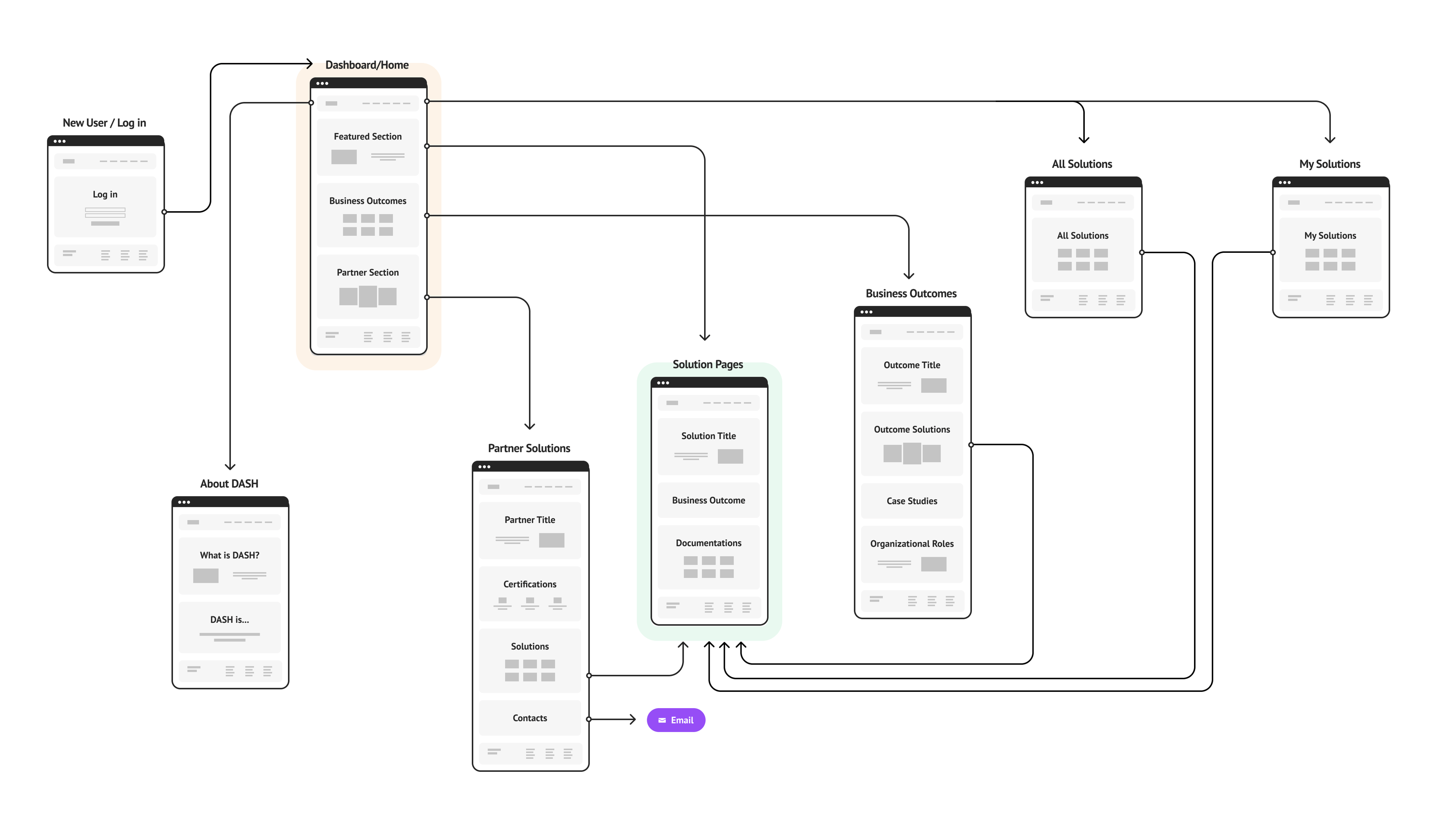
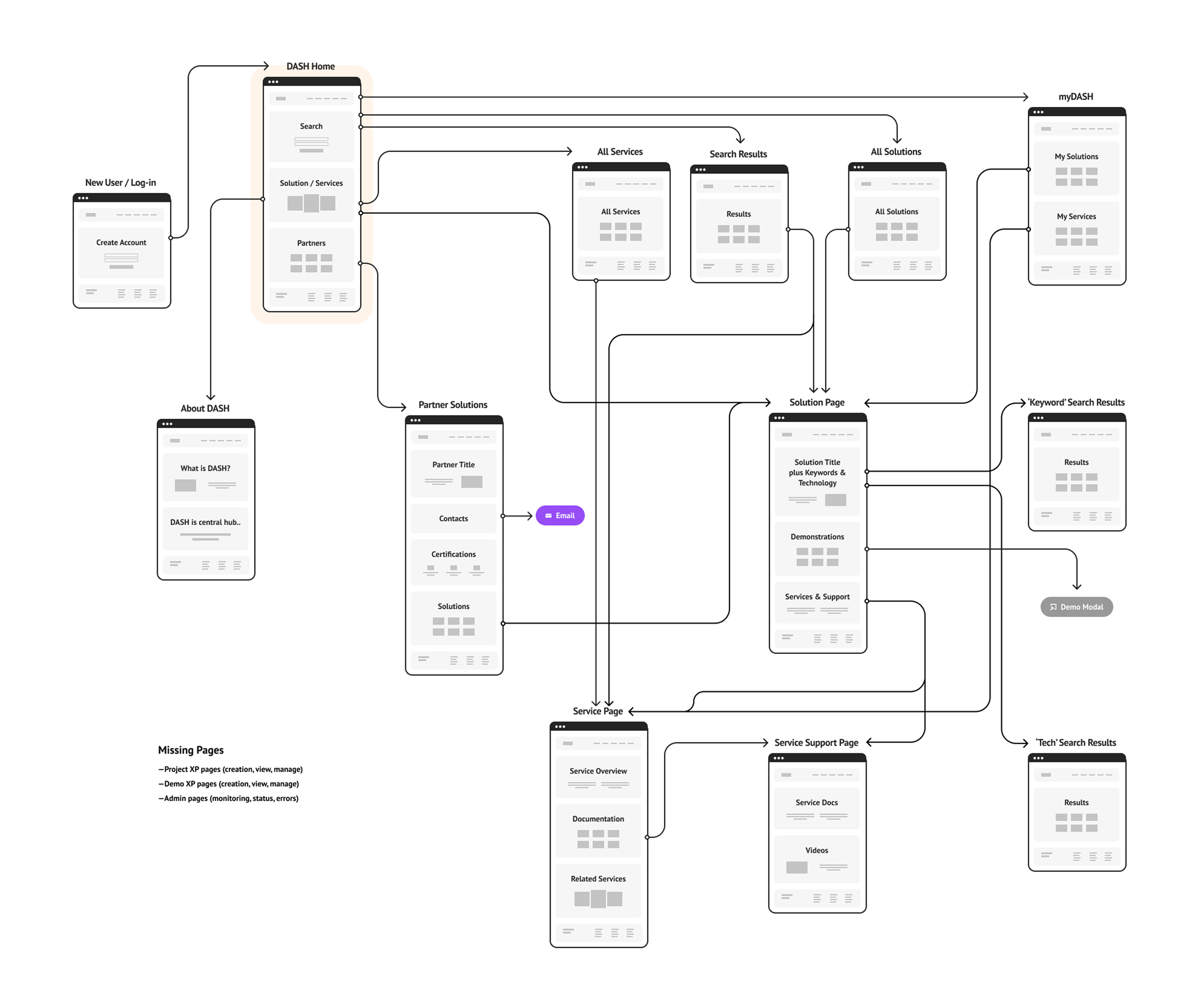
Mapped DASH, to see potential bottlenecks to share with stakeholders and my team.
Streamline the flows so partners and sales folks can find what they need easily.
Modernize the interface. Things were put together in haste to get off the ground.
Instead of starting over, we designed within established constraints.
To secure leadership support, I moved directly to high-fidelity mockups.


Screens looked like a typical website, and we wanted more of an application aesthetic. We started to evolve the visuals and functionality from the jump.
Collaborations were utmost importance for design, dev and business strategy teams. Working together we were able to evolve the App's functionality and flows without abandoning it's purpose.
The backend infrastructure had been established. I wanted to preserve as much of that work as possible, without compromising the design solutions we were proposing.
The Front-end UI is built with React, I got alignment for naming conventions, established brand colors, and utilized a component based approach, making the hand-off as smooth as possible.
Showing updated creative would be instrumental to get leadership to understand the value of this project. Timelines were accelerated and I went straight into high-fidelity mock ups and prototypes to present to decision-makers.


Things I learned throughout this process.